Designing A Website That Aligns With The Bloom Project’s Positioning
We recently collaborated with The Bloom Project, once a generic office space and now an innovative workspace situated on the vibrant Grey Street in Newcastle. We were tasked with defining their brand identity and positioning, in addition to creating a name, logo and website.
Drawing upon our extensive research, we identified the optimal positioning strategy, guiding the creation of a website to embody it. To delve deeper into the research that informed our positioning, including the creation of The Bloom Project’s unique name and logo, visit our previous blog post here.
Our website design, like the positioning, followed a progressive approach centred on wellness, community, and fostering a partnership-oriented environment where tenants are valued as essential partners.
A bright and welcoming design
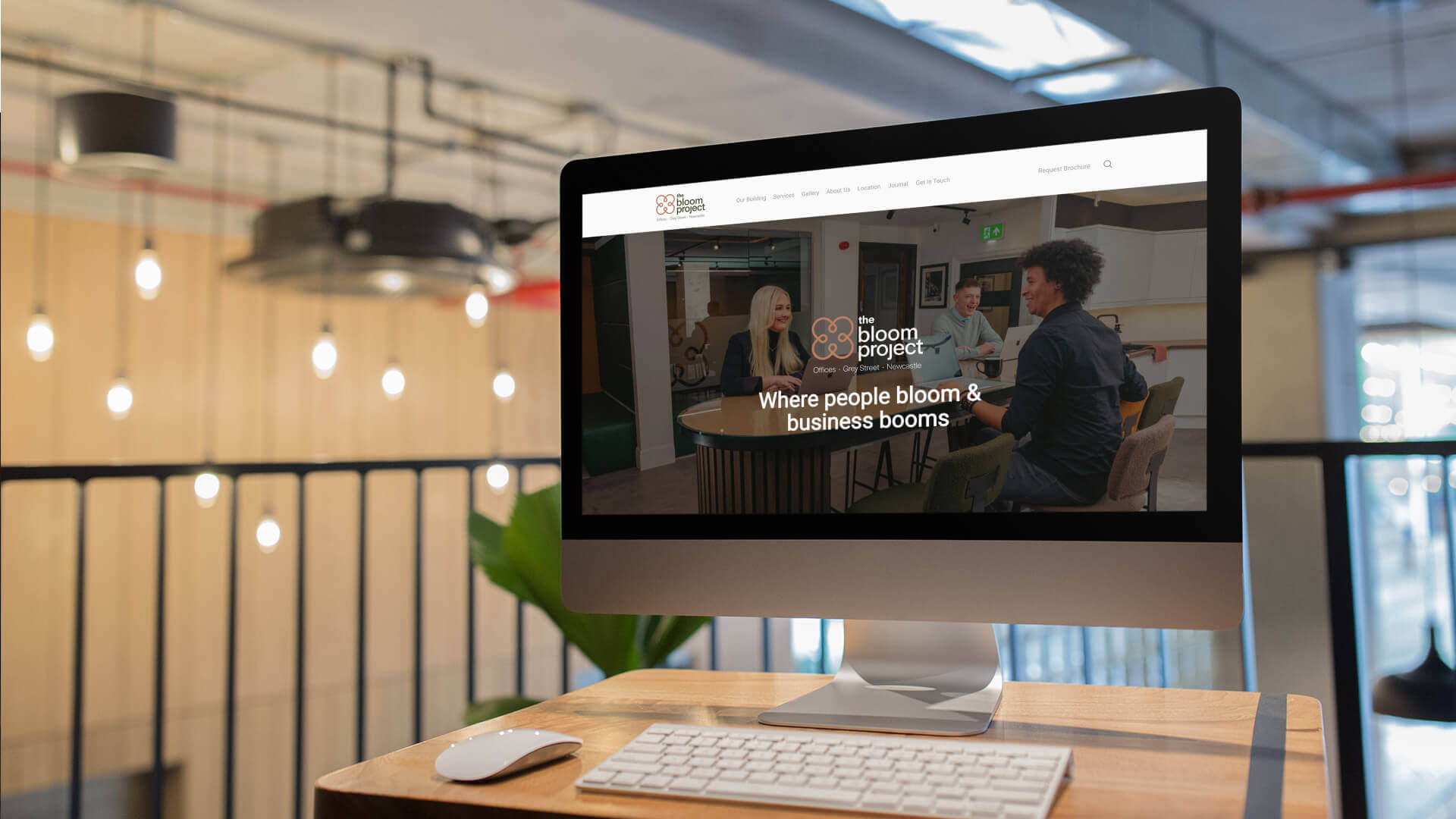
From the outset, our goal was to design a website that mirrored The Bloom Project’s physical space—a harmonious blend of functionality and serenity. We wanted to ensure the website was bright, professional, and welcoming.
With stunning interior photography and interactive floor plans, users are invited to explore the features that make The Bloom Project different from the many other office spaces already in existence.
An informative blog and platform for storytelling
We incorporated informative blogs on staff wellness, ensuring that the website served as more than a marketing tool—it became a resource for forming a culture of well-being within the workspace. The easy-to-use contact form further streamlined communication, encouraging seamless interactions between The Bloom Project and its target audience.
Beyond serving as a digital brochure of The Bloom Project’s USPs, the website serves as a platform for storytelling, with The Bloom Project conveying its brand narrative and values throughout.

Highlighting the location was a key part
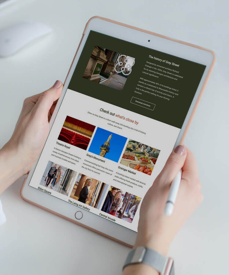
Given the significance of location to The Bloom Project’s brand identity, we made sure to incorporate detailed information about key destinations close to Grey Street. This served a dual purpose – not only does it enrich the user experience by providing insights into the surrounding area, but it also aligns with The Bloom Project’s commitment to accessibility.
In addition to highlighting key local landmarks and attractions, we included practical details about transportation links from major cities such as London and Manchester, underscoring the accessibility of The Bloom Project’s location in the heart of Grey Street.
”“We remain steadfast in our dedication to creating spaces where individuals and businesses thrive, and through DigitalKOG’s meticulous planning, positioning, and strategic branding, we've set a new standard for workspaces together.
Their expertise in crafting our website, logo, and brand story has helped shape our identity and enhanced our connection with our audience."
Alex AuldThe Bloom Project's Operations Director
”“Our research suggested that whilst all businesses in this category are branded, not all of them are brands. The key thing we learned from talking to the market was that their office was hugely important in recruiting and keeping staff but beyond providing the space and making the communal areas look nice, the landlords did nothing to help them attract and retain their people. They didn’t treat them as customers, just tenants.
So we saw a huge opportunity to disrupt the market whilst at the same time appealing to the key things the market wanted from the category. Just thinking of tenants as customers was revelatory and led to a brand which connects to the core concept from start to finish, through name, logo, offering, and communications.”
Mark TinnionDigitalKOG’s Brand Director


