


The Bloom Project's Branding Journey Unveiled By DigitalKOG
Recently, we partnered with The Bloom Project, a workspace nestled in the heart of Newcastle’s iconic Grey Street, in need of brand positioning.
We utilised our research findings to establish what the ideal positioning strategy should be before developing a name, logo and website to encapsulate it.
They were also leveraged to propose a distinctive brand positioning which aligned with market sentiments, landing on a forward-thinking approach focused on wellness, community, and treating tenants as valued partners.
Challenges and Solutions
Following on from our research findings, we took action to elevate The Bloom Project beyond a mere office space and transform it into a place of well-being and collaboration.
Navigating the intricacies of branding Grey Street’s building presented unique challenges. When we first started it was just an office space in need of renovation, named ‘General Buildings’. The brief was to create a brand from something that was completely generic. We needed to envision what the brand could be, rather than what it currently was.
Through collaborative efforts and industry insights, we successfully crafted a distinctive, unique brand identity that reflected what the market was missing.
The Research
As with all branding projects, we needed to work backwards. We carried out qualitative research to understand the market and inform our strategy, looking into who we were targeting, what we would represent to the market, and what our objectives were.
We can summarise our research in four key points:
1. The relationship between landlords and businesses was usually purely transactional and distant, lacking any sense of customer service.
2. Many office spaces primarily distinguished themselves through their interior design, creating a competitive environment focused more on aesthetics than functionality.
3. Office tenants appreciate the idea of how an office space could contribute to employee satisfaction and retention.
4. The prestigious location of the office made it a sought-after destination for successful, established companies rather than startups, which helped us focus our targeting efforts.
Strategic Positioning
Our approach to positioning The Bloom Project was strategic yet aspirational. We knew we also needed to craft a unique identity for 18-24 Grey Street (later to become The Bloom Project) and to establish a brand narrative that reflected our market findings.
With this in mind, our positioning strategy aimed to elevate Grey Street’s legacy by addressing its reputation for thriving businesses, and most importantly, by emphasising The Bloom Project’s commitment to holistic wellness and community support — we positioned it as more than a typical office space.
Based on the research, we presented a brand proposal which promoted employee happiness and well-being at work, a brand that saw tenants as customers, supporting them in their success.
The positioning was disruptive and did not play to how the market traditionally works. While others sell office space, we were selling happier, more productive employees.
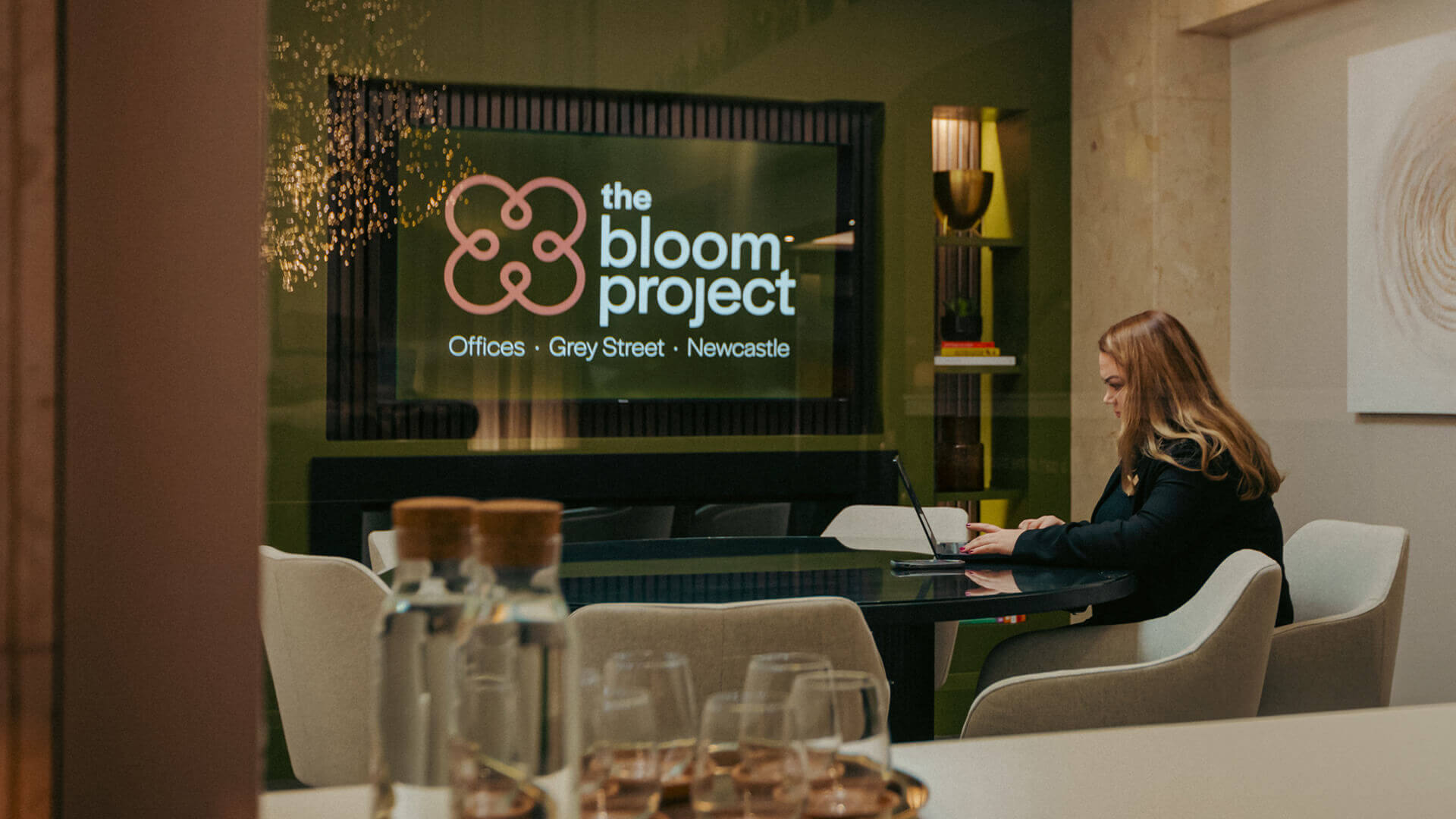
The Brand Story: Name & Logo
Regarding the name “The Bloom Project,” our decision was deeply rooted in the idea of growth and flourishing to reflect the positioning. We wanted a name that encapsulated the transformative journey The Bloom Project represents— where individuals and businesses alike bloom and thrive in an environment conducive to growth and well-being.
The name was deliberately crafted to reinforce our brand identity and stand out from the competition. The term “Bloom” evokes images of blossoms, symbolising the potential for growth and prosperity. By appending “Project” to the name, we referred to the dynamic nature of the business as it is an unconventional word in the industry, setting the business apart and making them memorable in a market where office names typically follow a different pattern.
Once we had devised a name to embody the positioning, we also crafted a logo to encapsulate and reinforce the positioning. Inspired by the concept of a “huddle,” the logo embodies the spirit of togetherness and support that defines The Bloom Project’s community. The subtle resemblance to a flower also symbolised growth, vitality, and positivity.
For the brand palette we chose earthy tones, reflecting the modern yet calming nature of The Bloom Project’s facilities. These colours evoke a sense of tranquillity, inviting employees to thrive in a nurturing environment that is conducive to productivity.
The logo, along with the website, were the tactical embodiments of the positioning. To find out how we designed their website, read our blog here.
”“We remain steadfast in our dedication to creating spaces where individuals and businesses thrive, and through DigitalKOG’s meticulous planning, positioning, and strategic branding, we've set a new standard for workspaces together.
Their expertise in crafting our website, logo, and brand story has helped shape our identity and enhanced our connection with our audience."
Alex AuldThe Bloom Project's Operations Director
”“Our research suggested that whilst all businesses in this category are branded, not all of them are brands. The key thing we learned from talking to the market was that their office was hugely important in recruiting and keeping staff but beyond providing the space and making the communal areas look nice, the landlords did nothing to help them attract and retain their people. They didn’t treat them as customers, just tenants.
So we saw a huge opportunity to disrupt the market whilst at the same time appealing to the key things the market wanted from the category. Just thinking of tenants as customers was revelatory and led to a brand which connects to the core concept from start to finish, through name, logo, offering, and communications.”
Mark TinnionDigitalKOG’s Brand Director